|
INTRO: I have dabbled twice in the stock market with very little success. One take away I got from my experience was that the stock market is not for the faint hearted, much like a day at the race track.. I figured that the stock market was gambling for rich people. I went in very naive and bet on companies I liked, no more analysis than that. My biggest win was a 10% increase in 24 hours and my biggest loss was 20% in 24 hours. There are loads of stock market celebrities out there, while living in Canada I frequently came across a guy on TV called "Jim Cramer", his show is called "Mad Money". On his show Jim makes the stock-market kinda fun, he bounces around the studio with what seems like a supply of endless comedic props, whilst people call him up for advice on what to buy and sell. So why am I talking about Jim? Well.. since I'm terrible of the stock market but pretty good with data, why not actually look at how successful a real stock market expert is? THE SETUP: They say most data analysis is 90% collection and preparation, that was 100% percent true in this case, but here's what I did:
Note: I'm no financial expert, I'm merely seeing if Jim has the chops! (is that a NZ saying?) THE TLDR: Summarized up, this is what I found from a high level:
THE DEEPER DIVE: It's very useful to note that some of these analyses are based on "The stupid", "The Realistic" and "The Perfect" stock-market scenarios, please..please don't think that you as an everyday person can achieve "The Perfect" based on what I'm saying (otherwise I wouldn't write this blog and keep all the information to myself!) Jims Recommended Stock Value Over Time 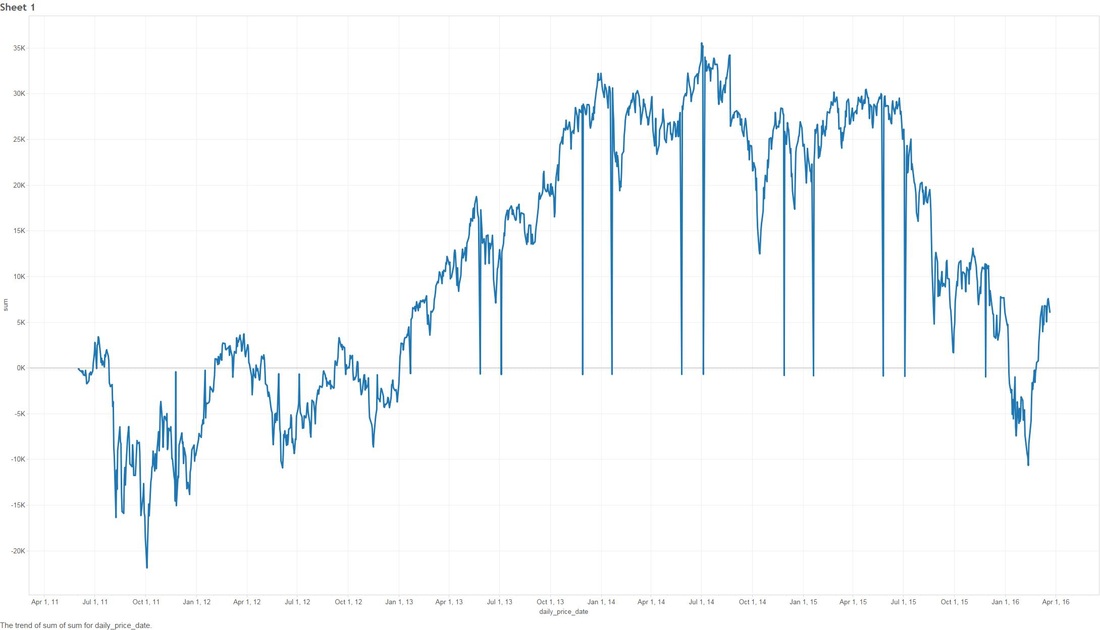 In the above scenario I have fictitiously purchased $1,000 worth of stock from each Bull (means buy) recommendation. Our highest point of earnings is the 1st of July, 2014 where our portfolio has gained ~35k in ~3 years. You might also see some points that dip to the zero line, this is where yahoo data still reports stock prices on American holidays but zeros them all out. The Perfect 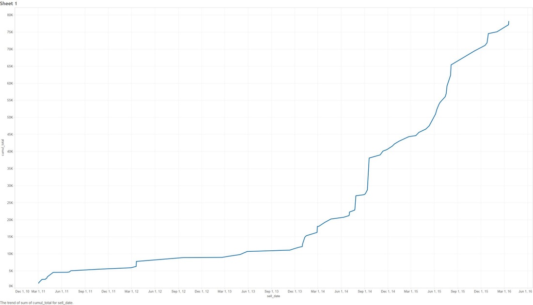 Buying $1000 worth of each recommended buy (bull), then selling them at the highest point price between 2011 and 2016. (again.. I have to point out that no one on this planet can do this). We have earned ourselves a handsome $79,138 with 2014 and 2015 showing the most gains, that's earning almost 80% over 5 years! The Realistic Sell at 10% gain (or max sell if 10% isn't met) 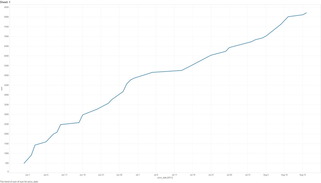 This is probably the closest to real home investors, once we reach a max gain of 10% we sell (or max sell if 10% isn't met). We made a profit of $8,210. You might be thinking that that's not much compared to the ~80% perfect sell, but the important thing to note here is we made $8,210 in around 1-3 months. Stock Industries Over Time 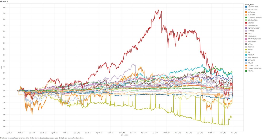 This one shows us the gains made via industry. Now before we get too far ahead of ourselves Jim Cramer may have suggested more of a particular industry which shows far more swing in a particular area. We'll clarify that below. (Remember this is the same as the very first graph, it assumes we never sell a share). Average Percent Gain By Industry 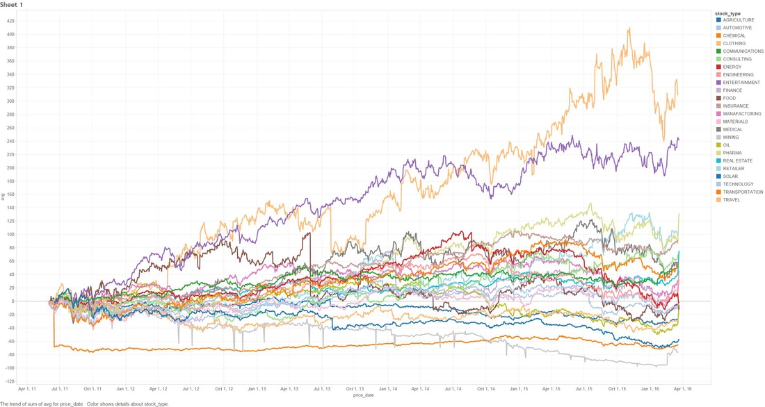 We are getting closer to what the numbers reflect here, be aware that those two heavy hitters (Entertainment and Travel) only contain 1 company in those sectors, Cramer did a great pick on them but it's not really fair to include in a "by Industry" analysis. Average Earned by Count Of Companies in Industry 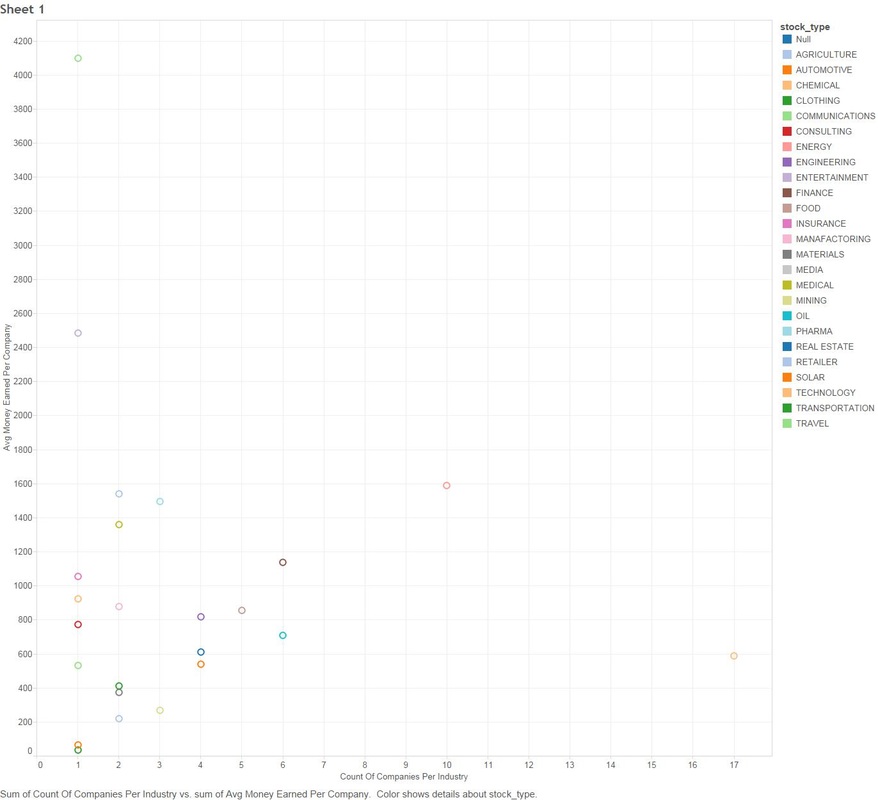 The above scenario is based on "The Perfect" sell. This graph sheds more light on what I was previously talking about above, Travel and Entertainment showing massive earning increases, but there is only 1 company in each of those categories. Jim Cramer has numerous sections in his show where he talks about diversification, violent percent swings in either direction are mainly based around the fact we have a smaller amount of companies in those industries. Segment Specials 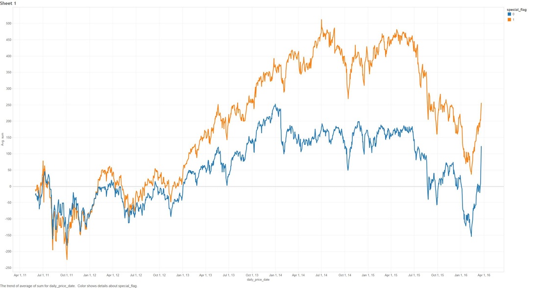 This graph shows the average sell price for a share over time split by "Specials". A recommendation with a special of 1 means it was a special and 0 was on a lightening round. A segment "Special" is one that Cramer may interview a CEO or just plain old informs us what he feels is a buy and wants to let us in on it. It's interesting to note that Jims "Specials" are really propping up the figures with non-special recommendations falling flat and lower in 2014. Compare to the S&P and DOW Below are the graphs for the S&P and the DOW over the same period. S&P 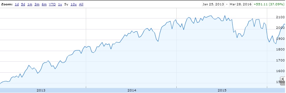 DOW 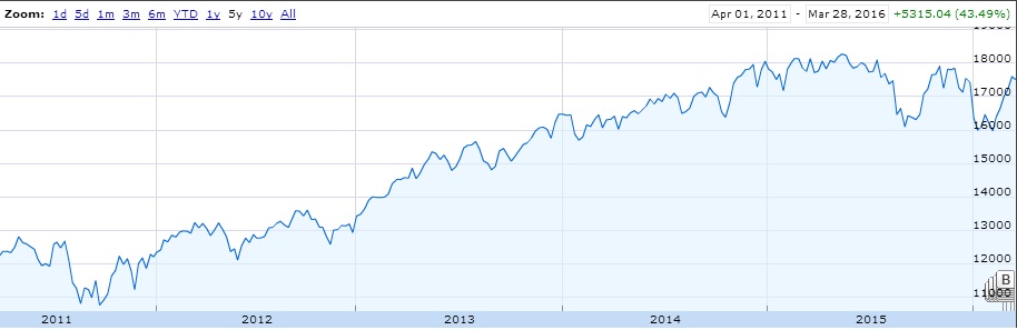 What are the S&P or DOW? To quote google:
S&P "The Standard & Poor's 500, often abbreviated as the S&P 500, or just "the S&P", is an American stock market index based on the market capitalizations of 500 large companies having common stock listed on the NYSE or NASDAQ. The S&P 500 index components and their weightings are determined by S&P Dow Jones Indices." DOW The Dow Jones Industrial Average (DJIA) is a price-weighted average of 30 significant stocks traded on the New York Stock Exchange and the Nasdaq. The DJIA was invented by Charles Dow back in 1896. Why are these relevant? Well if you have been following the stock market since 2009, there has been some massive investment, we want to make sure that what Jim is saying isn't just riding off of the coat-tails of a massive stock climb. FINISH! That's it folks! I had fun looking throughout the data, less so collecting and cleaning. I'm kinda tempted to cut more time segments for further analysis, especially since the market is in a little bit of turmoil in 2016, but there is a baby on the way and there is much to do!
0 Comments
Leave a Reply. |

AuthorNew Zealand big data nerd, facial hair sculptor and classic car fanatic. Owner of needles.io, freelance big data consultant, ex Activision. Archives
April 2016
Categories
|
 RSS Feed
